With the spring 2022 issue of the Island Dispatch and over the next month, we are launching a new look for the San Juan Preservation Trust. This means an updated logo, color palette, typefaces, and other visual elements that say at a glance, “This is us!”
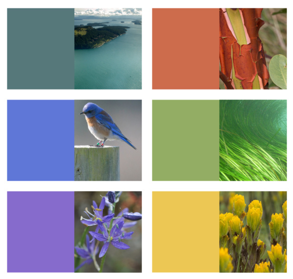
The new SJPT color palette is taken from the colors of the San Juan Islands themselves.
Why the change? Mainly it’s because we’re catching up to ourselves. With our latest round of strategic planning that took place in 2018-19, we adopted a new way of describing the core of our mission. Our newly refocused mission centers around three Cs: Conserve, Care, and Connect.
This fresh take on our mission has called out for an equally freshened-up graphic representation of who we are. Our logo and other aspects of SJPT’s visual brand, however, have not changed significantly since the early 1980s. As we step up efforts to broaden our community of supporters—especially to include diverse members of younger generations, who represent the future of conservation—we felt it was high time for a brand facelift.
Our new look will make its official debut at our online Annual Meeting on May 19 (sign up here to join the Zoom meeting). It will be evident on our website, in our publications (print and email), in our future videos, and anywhere else the SJPT logo appears.
We worked with Kevin Berger and members of his team at Graphiti Associates, our long-time partners in design. The most distinctive part of the new logo is the “circle of life” graphic that accompanies our name. The circle weaves together key parts of the natural systems that make these islands so worthy of the preservation work that we do together.
That work is made possible through your generosity as donors and volunteers. Thank you so much! We hope you like our beauty makeover.
